Beth mocked up these examples of how the promotion would work in Instagram. They are very effective and add context to the advertisement.
Showing posts with label Archer. Show all posts
Showing posts with label Archer. Show all posts
Sunday, 5 June 2016
Tuesday, 10 May 2016
Archer: Netflix Branding & Ident
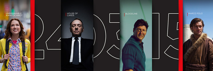
Looking further into the Netflix brand I began with the main item, the ident. It will have to be part of the videos in some degree to bring Netflix and Archer together. Below are the idents I was using on the static images based the end of video cards for their original series'.


It was here I became aware of their logo change. I thought both were used but it has since been replaced by the clean, minimal version. Apparently the change of the logo in 2014 didn't go down well with some of its users.

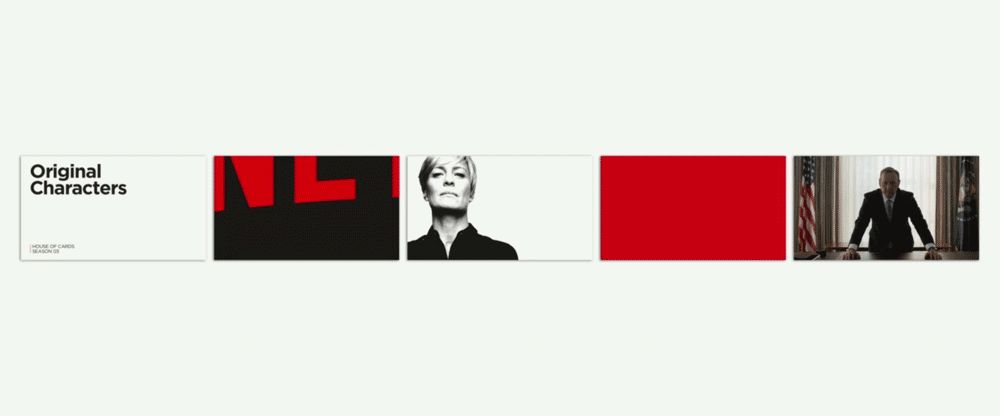
 The solution: The Stack, a visual metaphor and identity system in one. It implies both the infinite, ever-changing catalogue and the custom-curated conent that make up the core of the Netflix service.
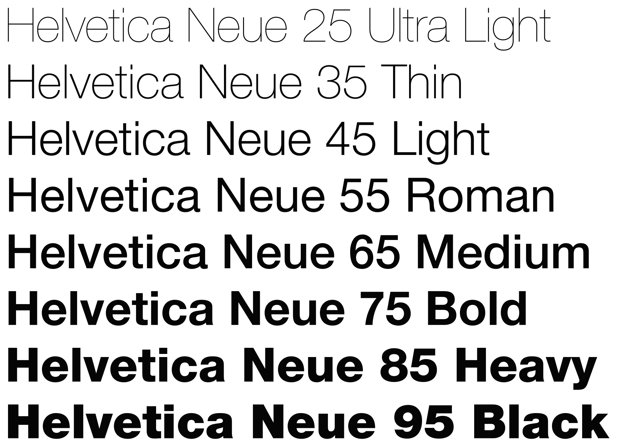
The design is clean and clear with clever use of movement to show more content than one static image would allow. The typeface is Helvetic Neue in a custom typeset. Their photography direction is clear, hi-res and dramatic. In other working are often low saturation.


It was here I became aware of their logo change. I thought both were used but it has since been replaced by the clean, minimal version. Apparently the change of the logo in 2014 didn't go down well with some of its users.
I then went on to look into the recent rebrand of the entire company, to accommodate it's new logo because of course, we want our promotional animations to have some solid context we are designing them to promote the return of Archer to Netflix. This would help us to then apply it to our existing animations and tie in the branding and animation together into one package.
The Re-brand
Netflix is the world’s leading streaming media service and serves over 65 million users in more than 50 countries worldwide and is constantly growing. Being one of the original innovators of streaming content, they’ve shot up in popularity over the last 5 years whilst producing a growing range of original series. Gretel, New York design agency partnered with the Global Brand Team at Netflix to develop ta through-line: a conceptual and visual thread to unify every touchpoint. They say their collective challenge was 'to create something broad enough for a global brand but still unique and identifiable. It had to marry the brand with the content. It had to be variable yet systematic and bulletproof. It had to be visually striking, adapt to any format, and hold up to interpretation by agencies and vendors around the globe.'
The solution: The Stack, a visual metaphor and identity system in one. It implies both the infinite, ever-changing catalogue and the custom-curated conent that make up the core of the Netflix service.The design is clean and clear with clever use of movement to show more content than one static image would allow. The typeface is Helvetic Neue in a custom typeset. Their photography direction is clear, hi-res and dramatic. In other working are often low saturation.

Sunday, 8 May 2016
Archer: Defning Style
 After me and Beth played around with styles we brought our work together. Beth had created some great stills, and I preferred them over mine.
Beth created a few different versions of some quotes and we worked with them. I then went on to create boundaries and alter sizing and positions, focusing on hierarchies and syntax that Beth speaks about in her research.
This way of working was very effective. The more we work together the quicker we become at communicating and creating outcomes.
Beth clearly explained to be her ideas for the animation shown here at the bottom. She explained the first frame she created, the words beginning in a heap and moving forward to form their sentences. It was simple and effective, and I refined the idea making use of the colours she had chosen, changing them to lines to better represent the quotes mention of coke and jail.
By the end of our conversation/ session we had clear final frames for the moving images we wanted to do. From here we began the steep learning curve that is Adobe After Effects.
Beth's Iterations


My Development


Beth's Iterations


My Development


Archer: Aesthetic
 The time setting of Archer is comically anachronistic, the writers constantly mix technology, fashion and historical backdrops of different decades. The characters wear 1960s clothing and hairstyles with the show frequently using pop-culture references which are contemporary to the 2010s, yet character backstories place them at older events.
The design aesthetic of Archer is very reminiscent of Saul Bass' work. It is a pastiche James Bond-esce cartoon, which makes fun of all the tropes surrounding the genre.
The title sequence best sums up the style and setting of the cartoon. The bright colours are engaging and presented in large blocks against the black background.
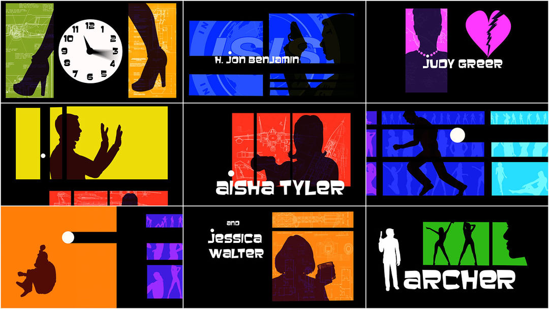

The similarities in style is uncanny and very exciting to explore such an iconic design motion picture style through a modern subject, something that is actually very comedic and tacky.


The next step is to create some static images that will fit along this theme and style. Beginning with static images will help us know what the final animation frames will look like, once we move on the the kinetic bit of the type.
Archer: First Experimentation
 We wanted to use type to advertise the seventh season of Archer, using Netflix as a platform. I began by collecting colours from the title sequence to create a palette to work from. Beth & I had also agreed that we wanted a strong, bold sans serif. We began exploring options looking into past body copies used by Archer.
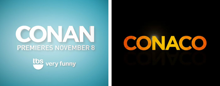
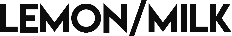
Through our search I found the Conan/Archer crossover and really liked the type used, which led me onto the overall branding of Conan and his production company Conaco. The typeface used is Gotham, exactly what we were looking for. Beth also suggested Lemon/Milk so we experimented with both before settling on one.


 I began by taking a quote and roughly sketching out the layouts to help be better understand how I would like words to fit. Referring back to emphasis and sizing, I played with sizes and positions so that the most important words, pertinent to the joke, were largest. I also utilized the different colours to help aid the process.
 Drawing the elements out before working digitally is always helpful. It cuts down on time that would be spent creating each iteration.At this point I like the look of them though they are very plain, more exploration will hopefully find a solution to this.


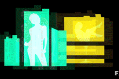
 Within other quotes I explore different layouts. I wanted it to still look clean and organised, despite various sizes.I then thought about limiting the sizes and having straight lines. Preferably justified, but the length of words made it almost impossible without obvious tracking issues as seen below.I went back and forth with type size and layout incorporating punctuation and ellipses to break up the lines and try to insinuate some kind of cadence.
I also began to play with the inclusion of the Netflix ident, in the bottom right corners. I followed the layout of the still ident found at the end of video advert and mocked it up as a place holder, to remind myself of it's intent.


On a whim, I added drop shadows to the type, using the darker colours found within the title screen. This definitely makes it less boring and more striking, however, it does not immediately scream Archer, a show with such a distinct style as explained before. We will have to come back together to see better understand and apply the aesthetic of archer.


Saturday, 7 May 2016
Archer: Syntax & Planning
Beth suggested that we look into the syntax of the quotes we had chosen, and how it is important to the visual representation of them. She wrote some notes on tones of voice and how to best represent the voices digitally. We dissected our final quotes we hoped to use as Beth looked more in-depth into how they could translate on screen.
 |
| 'If I stop drinking all at once I am afraid the cumulative hangover would literally kill me" |
"Lana, I've never had a death wish, it's just that I don't believe that, I personally, even can die"

 |
| "Remember when the office shut down and we spent an entire year as coke dealers?" |
 |
| "I'm getting my turtleneck. I'm not defusing a bomb in this!" |
Archer: What is Archer? & Quotes
'Originally working for the "International Secret Intelligence Service" (ISIS) in New York City, suave, profoundly self centered master spy Sterling Archer deals with global espionage, as well as his domineering, emotionally-distant mother and boss Malory Archer, fellow agent and ex-girlfriend Lana Kane and fellow employees.' While developing the sixth season, the show's producers decided to end the use of the term "ISIS" the fictional spy agency the characters worked for in seasons 1-4) due to its growing association with the Islamist terrorist organization of the same initials. Archer merchandise with the ISIS initials was also withdrawn from sale.
It definitely has a cult following despite having a relatively modest start. It has since blossomed into FX's top-rated comedy. Its strength is among adult men under 35 and It attracted just over 1.1 million young males during season 4, surging 55% versus the show's third season.
During the thirteen weeks it aired in 2012's winter, the show consistently drew more men under 34 than any of NBC's Thursday comedies. It scored bigger ratings than every other Thursday night TV series, minus CBS' The Big Bang Theory. And so far, the only scripted comedy or drama on basic cable that has done better among young men than Archer is AMC's The Walking Dead.
Source: Vulture.com
We began by collecting Archer some of our favourite quotes would fit our brief as subjects of these type animations. As all three of us are big fans of the show so the careful elements would be relatable and accessible to a new audience. The humour of the show is very dark, fast and specific to the show. The aim is to find lines that work out of context and are still funny. We began by collectively choosing some of our favourite quotes and narrowing them down to those that fit the brief. Our process was to work collaboratively in a document to collect the lines first and then spent time narrowing them down to our favourites.
- “All I’ve had today is like, six gummy bears and some scotch”
“Holy shit snacks”- “I’m not slurring my words, I’m talking in cursive”
- “If I stop drinking all at once I’m afraid the cumulative hangover would kill me”
"Are you kidding? Dude. Bros before apparent threats to national security."- “Lana, I've never had a death wish, it's just that I don't believe that I personally even can die.”
“You killed a black astronaut Cyril, that's like killing a unicorn!”
“If I wanted to hear you people scream, I'd have you flown to a CIA black site in Morocco and listen to your torture session on speakerphone!”“Just the tip!”- “Why are your plans always so complicated? You're like Wyle E Coyote with access to predator drones.”
“Something, something, danger zone! I know. I’m not even trying anymore.”“Cyril, I paid her, I get to carry her corpse.”- '"Guys, come on. Can't we have one poker night without a hate crime?”
“You're gay! I mean, I am, too. We're both gay.”- “Remember when the office shut down and we spent an entire year as coke dealers?”
- “I'm getting my turtleneck. I'm not defusing a bomb in this!”
Lana: “Okay, that was a fluke.”
Sterling: “Yeah, a fluke of nature. Because I happen to have perfect situational awareness, Lana. Which cannot be taught, by the way. Like a poet's ... mind for ... to make the perfect words.”“I mean is Is it too much to ask during the goddamn work day for 80 minutes each of uninterrupted dump time?”“No, no, turn it on. I can do both.”“Well, I hope you're happy because I feel like a total dick, and kind of a racist. And I resent you making me feel like that...because I'm not a racist.”“That wasn't a brain chip. That was a just a sticker of the backpack of a little Lego spaceman.”Malory: “It's okay! They're just blanks.”
Lana: “Well, see, you say that …”
Malory: “But they were blanks—weren't they?”Sterling: “Only if the back of his skull picked that exact moment to explode outwards”“I couldn't hear you over the sound of this gigantic freakin' tank!”
Some weren't used because they were too long or plain unfunny. From here we went on to look into the visuals and how they should be presented, in order to relate to archer.
Wednesday, 4 May 2016
Archer: Kinetic Typography Inspirations

As a collaboration project, myself, Beth Taylor and Ashley Woodrow-Smith have decided to explore kinetic type, as it is a media we've always wanted to learn and get involved with. we have decided to focus on the cartoon Archer. I've begun to look into kinetic type and various examples to better understand the outcomes I want to achieve. I personally discovered it through stand up comedy, of which I am an avid fan and began to find these kinetic videos of sections of comedians sets, and found them incredibly engaging.
The one piece of work that made me realise the mediums effectiveness was when I saw Tim Minchin's - Storm animated movie; A nine minute beat poem about existence.
Tim Minchin - Storm (Animated Movie)
It is a beautiful mix of animation and kinetic type that has worked very well as a story telling tool.
From this, I searched other comedy based kinetic type and found ones of varying quality. From ones of very basic type use to including illustrations and more dynamic movement. I think that analysing other typographies will help me understand not only the direction I'd like to go in, but help me get a preference of style, speed and tone.
Measuring Quality
I know that there is a clear difference between kinetic type done well and not so well. I feel it's important to understand what those differences are, that will help me recognise the quality in my own work.

The first one here (Duckman on Comedy) is very advanced; it used a mixture of illustration and moving images to help communicate the message. The main type sticks to a colour scheme and typeface, alike most do in the videos i've seen. Also the use of a textured background (similar to the one above) I find a a lot more engaging and 'gritty' than those that are plain. Again, this is something that would be directed by the audio's tone.
The second one uses various different typefaces. Though not as 'clean as the first', in this context, it's used as a storytelling technique. It also involves illustrations but also 3D images. In terms of preference, I prefer the structured uniform style of the first. I feel sticking to one typeface allows a better flow, especially for longer videos.
Also a 'clean' typeface is important. Something that read's well instantly. This is something I'll definitely look further into, most likely looking back at some of first years design principle work to better gauge what would be most suitable in this format.
My content will most definitely dictate the style and pace of my animations, and with Archer having such a distinct design aesthetic, I think will allow for very interesting and engaging outcomes.
Archer: Kinetic Typography Definition & Origins
Definition: Kinetic typography refers to moving type. It is an animation technique that is used to make lettering move; (expand, shrink, fly etc.)
Kinetic typography use has almost exploded recently because of more use of the technique in web design. Once something that was only used in video and television, kinetic typography is gaining popularity as a background effect on websites and in web-based videos. (All of this is possible thanks to higher and more common broadband and increased Internet and web surfing speeds.)
To me, kinetic type is a great way to convey emotion and tone. It adds so much to audio. It can help create a visual where it otherwise wouldn't exist. It is affordable for for those with limited budgets (me) and can add interest to an otherwise stationery type design.
Through Research, I've found that kinetic type is being labelled as an 'emerging trend' with the latest and most frequent use being found in 'lyrics videos' made famous by VEVO Channels; A way to by time, yet record views, before their artists release music videos for a single gaining popularity.
But what I found it that it's been around for a while, which is something I didn't know:
"Researchers at the Human Computer Interaction Institute and School of Design at Carnegie Mellon University have traced the first use of kinetic typography to the 1959 Alfred Hitchcock’s 1959 film “North by Northwest.” In the opening credits, type is used in a movable format.

A year later, the effect was used again in “Psycho.” “This work stemmed in part from a desire to have the opening credits set the stage for the film by establishing a mood, rather than simply conveying the information of the credits.”
Source: The Kinetic Typography Engine: An Extensible System for Animating Expressive Text


Since then, the use of kinetic typography has become more common in film titles and television adverts. An example that was often seen on TV is 's first ever ident for Channel 4, in use from 1982 created by Lambie-Nairn.
Using this as a base, Channel 4 has only gone on to develop it's identity time and time again. From the 'perspective' idents a few years ago to their most current re-launch only a few days go, which refreshingly, is almost exactly the same as Nairn's first creation over 30 years ago.
Again one the first times I remember noticing kinetic type was in Pepsi's "Refresh Everything' adverts. The advert was created to 'show off' Pepsi's new logo. Again, it is bright, clear and engaging and a great way to 'showcase' A new identity.
More recently, it has become most popular in website design, mobile apps and online videos.
It is used for such a wide range of platforms from advertising & promotion to art to music videos. It's become a tool that has progressed static image, with video platform like Instagram, vine and snapchat, moving image is becoming increasingly important as a method of communication.
Subscribe to:
Posts (Atom)