The time setting of Archer is comically anachronistic, the writers constantly mix technology, fashion and historical backdrops of different decades. The characters wear 1960s clothing and hairstyles with the show frequently using pop-culture references which are contemporary to the 2010s, yet character backstories place them at older events.
The design aesthetic of Archer is very reminiscent of Saul Bass' work. It is a pastiche James Bond-esce cartoon, which makes fun of all the tropes surrounding the genre.
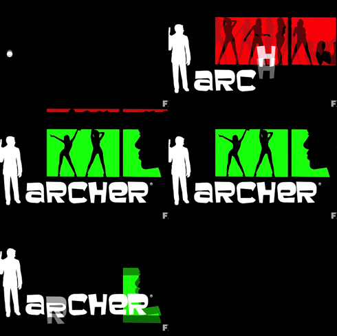
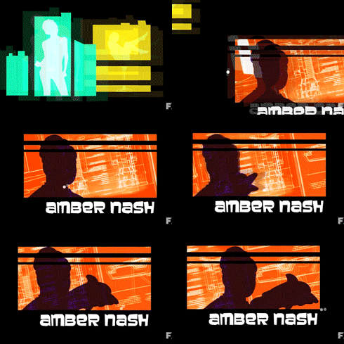
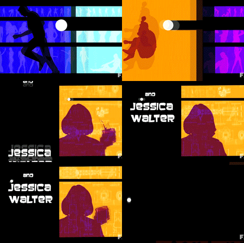
The title sequence best sums up the style and setting of the cartoon. The bright colours are engaging and presented in large blocks against the black background.

The similarities in style is uncanny and very exciting to explore such an iconic design motion picture style through a modern subject, something that is actually very comedic and tacky.
The next step is to create some static images that will fit along this theme and style. Beginning with static images will help us know what the final animation frames will look like, once we move on the the kinetic bit of the type.


