
 I spent this editing time to add shading to the image. Though it is not as clean and simple it adds depth to all the little details.
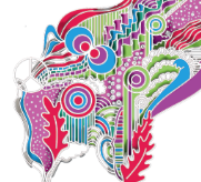
I then went back to adding colour using the same colour palette. This was just me playing with the colour scheme, outline colours, weights and opacities.
After finding colours/designs I like I will have to think about setting, size and background colours.
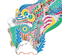
Below are experimentations with the opacity of the outlines and borders.
After finding colours/designs I like I will have to think about setting, size and background colours.
Below are experimentations with the opacity of the outlines and borders.


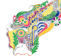
The colours are quite jarring so I then went on to look at the hues of the original colours to see if there was a more harmonious version I could use.
Again, looking at stroke and borders, editing the weights and opacity of the shadows.

