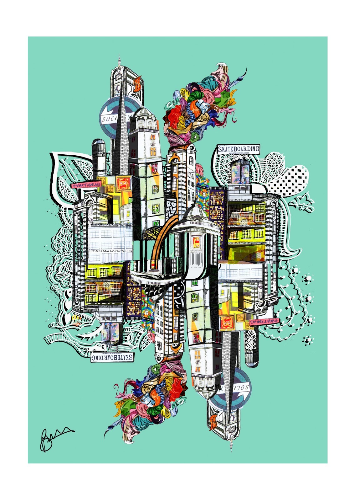
I'm very happy with the visual at this stage. The heights and shape of the buildings look nice. If I had more time, I would have liked to create something that was a lot more detailed in terms of intricacy. Perhaps this it something I can explore the next time I use collage.
After trailing the 'island' image, I didn't like the vast difference so instead, I flipped the image and created a reflection. The task was to blend the two and alter the reflection slightly so they don't look so uniform.
I don't yet have much of a online presence. so I just wanted to send DR. ME a piece of work that they would want to keep. I took this from a workshop in Level 4, where we were asked to create something that someone would 'want to keep'. Back then it was something I didn't engage it too well but now, I revisited the mindset when it came to this brief.
Whilst digging through old patterns I found floral illustrations, which I refreshed and utilized here. Again, weaving it throughout the buildings. I wanted it to look busy and very hand-made. It's interesting to bring back old creations and find a home for them in new designs. It reenforces my want to do things outside of 'course work' and continue the life of a doodler, because it call comes in handy.
I then moved onto creating a background. I chose an orange, due to the undertones in the image overall. I felt it was most fitting, and was well placed with the loose yet clear theme. There was a fear that the main collage would be lost within the busy background but this was not the case. The whites of the building are a nice contrast and adding the white layer of the doodle texture was a good way to add depth and business.
Willing to explore further I looked into other options of colours settling on a mint colour, inspired by the bright green seen in the center of the collage. I liked the second option better. The clean colour was a nice stark difference from the busy elements and only added to it's beauty in colour and saturation.
This will mot definitely be my final piece. I feel there is always the chance of over working a project this 'craft' based. I'm incredibly happy with the outcome and look forward to sending it off.


