Beginning steps were to establish a strong shape /icon that could carry the identity. Many other real-estates I looked at had a strong visual image that accompanied their title. I Couldn't change the company name 'Spanish Holiday Homes' which is far from catchy, so I wanted to create a strong visual that would carry past the overly descriptive name.

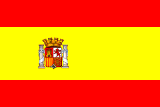
The shapes began with the flag and graduated into subtle house visuals, as seen in the other examples. I liked the circular base and began to play with the 'roof' shape, using colours to play with depth.
Once the shape was established I experimented outside of the red and yellow just to educated myself on the other iterations.
They all were nice, however toward the end I did like the idea of the colour concept comming directly from the spanish flag, so a different version of the red & yellow was kept.


