At this stage I worked rather quickly, sending drafts and versions of the quote on the card, after trying it in a standard cursive font but it began to look far too structured and 'whimsical'. cursive fonts have an immediate association with femininity. I then figured to render it myself, writing out the quote but my handwriting was not clean and standardised and quickly became the opposite - far too haphazard.
The client then suggested that he write out the quote. His handwriting is already naturally cursive and the idea of that personal touch was very fitting. He sent his writing and I began to work with it, first by re-tracing letters and issues with spacing.


I mocked it up on the card and it still look far too rough, I then went back to clean up the letters further, so I was able to use a larger chunk of the writing.

Below are the before and after of the editing process; although subtle, when cleaned as a whole text, it made a huge difference.


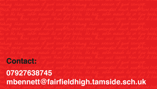
 From here I stacked the first portion of the quote to create a repeat pattern to use at a lower opacity. I continued to play with the words, in various colours, sizes and opacities until it was clean and minimal. The smaller the type the better it looked. The underlying concept is still there and still strong, despite legibility. I feel the lowest design is the most successful.