It was here I became aware of their logo change. I thought both were used but it has since been replaced by the clean, minimal version. Apparently the change of the logo in 2014 didn't go down well with some of its users.
I then went on to look into the recent rebrand of the entire company, to accommodate it's new logo because of course, we want our promotional animations to have some solid context we are designing them to promote the return of Archer to Netflix. This would help us to then apply it to our existing animations and tie in the branding and animation together into one package.
The Re-brand
Netflix is the world’s leading streaming media service and serves over 65 million users in more than 50 countries worldwide and is constantly growing. Being one of the original innovators of streaming content, they’ve shot up in popularity over the last 5 years whilst producing a growing range of original series. Gretel, New York design agency partnered with the Global Brand Team at Netflix to develop ta through-line: a conceptual and visual thread to unify every touchpoint. They say their collective challenge was 'to create something broad enough for a global brand but still unique and identifiable. It had to marry the brand with the content. It had to be variable yet systematic and bulletproof. It had to be visually striking, adapt to any format, and hold up to interpretation by agencies and vendors around the globe.'
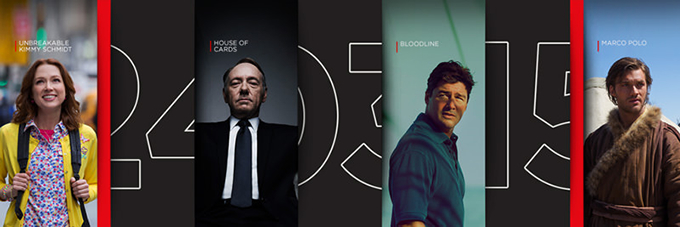
 The solution: The Stack, a visual metaphor and identity system in one. It implies both the infinite, ever-changing catalogue and the custom-curated conent that make up the core of the Netflix service.
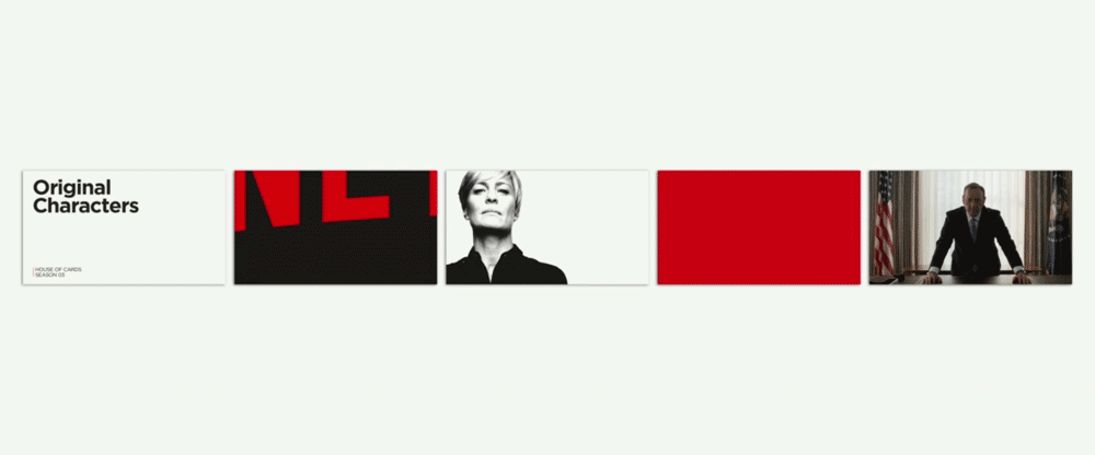
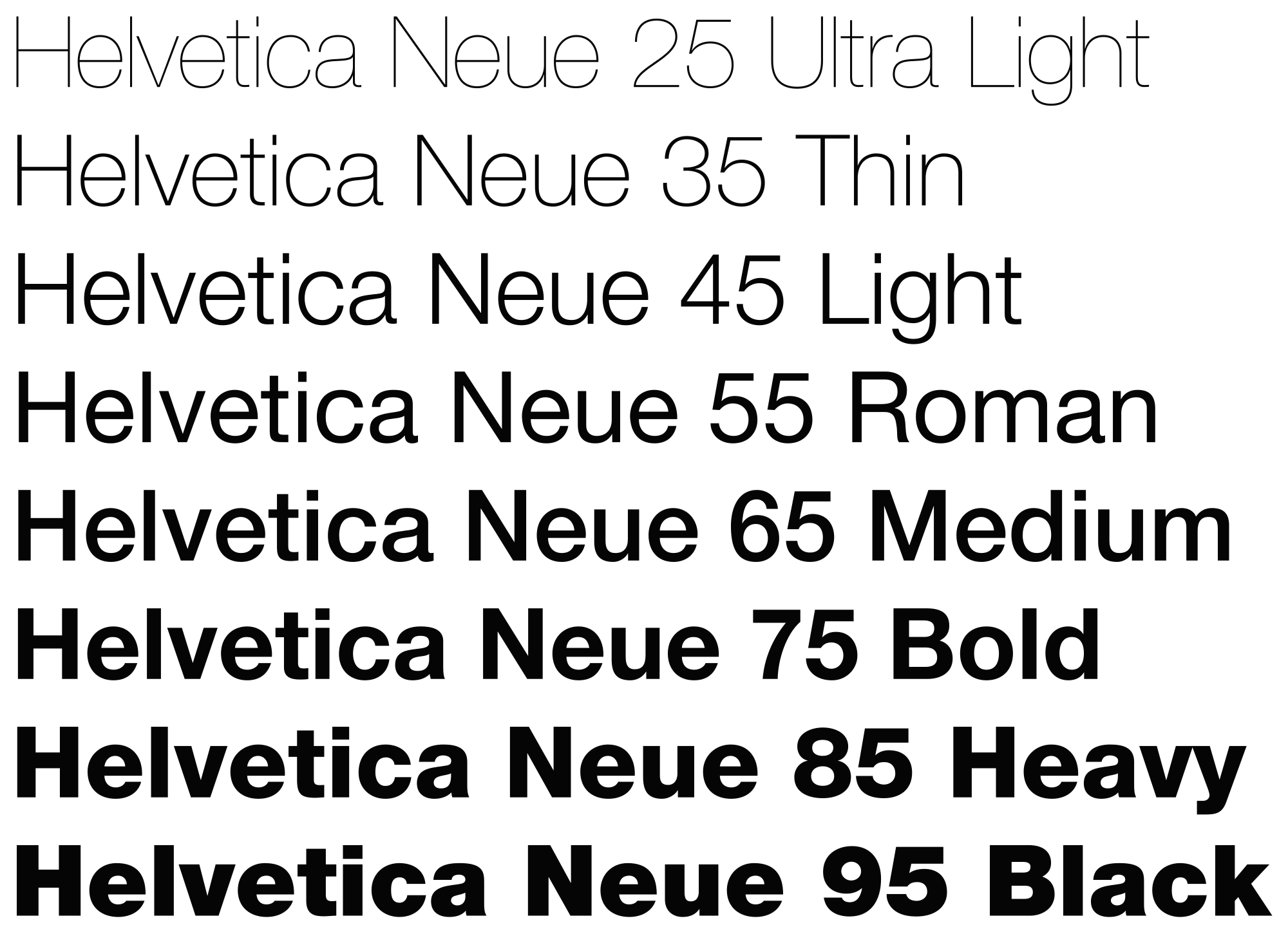
The design is clean and clear with clever use of movement to show more content than one static image would allow. The typeface is Helvetic Neue in a custom typeset. Their photography direction is clear, hi-res and dramatic. In other working are often low saturation.