 We wanted to use type to advertise the seventh season of Archer, using Netflix as a platform. I began by collecting colours from the title sequence to create a palette to work from. Beth & I had also agreed that we wanted a strong, bold sans serif. We began exploring options looking into past body copies used by Archer.
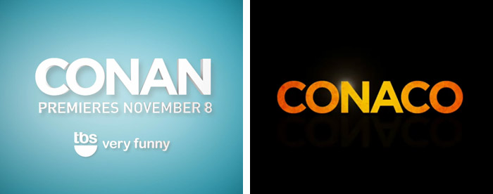
Through our search I found the Conan/Archer crossover and really liked the type used, which led me onto the overall branding of Conan and his production company Conaco. The typeface used is Gotham, exactly what we were looking for. Beth also suggested Lemon/Milk so we experimented with both before settling on one.

 I began by taking a quote and roughly sketching out the layouts to help be better understand how I would like words to fit. Referring back to emphasis and sizing, I played with sizes and positions so that the most important words, pertinent to the joke, were largest. I also utilized the different colours to help aid the process.
 Drawing the elements out before working digitally is always helpful. It cuts down on time that would be spent creating each iteration.At this point I like the look of them though they are very plain, more exploration will hopefully find a solution to this.
 Within other quotes I explore different layouts. I wanted it to still look clean and organised, despite various sizes.I then thought about limiting the sizes and having straight lines. Preferably justified, but the length of words made it almost impossible without obvious tracking issues as seen below.I went back and forth with type size and layout incorporating punctuation and ellipses to break up the lines and try to insinuate some kind of cadence.
I also began to play with the inclusion of the Netflix ident, in the bottom right corners. I followed the layout of the still ident found at the end of video advert and mocked it up as a place holder, to remind myself of it's intent.


On a whim, I added drop shadows to the type, using the darker colours found within the title screen. This definitely makes it less boring and more striking, however, it does not immediately scream Archer, a show with such a distinct style as explained before. We will have to come back together to see better understand and apply the aesthetic of archer.


